Facility Branding

Copyright 2023 College of the Mainland. Photo credit: Scott Turnbough.
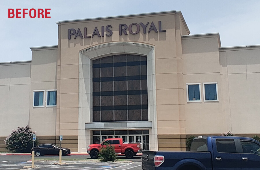
Copyright 2023 College of the Mainland.
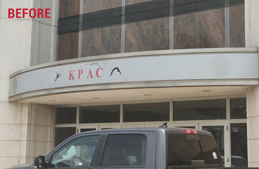
Copyright 2023 College of the Mainland.
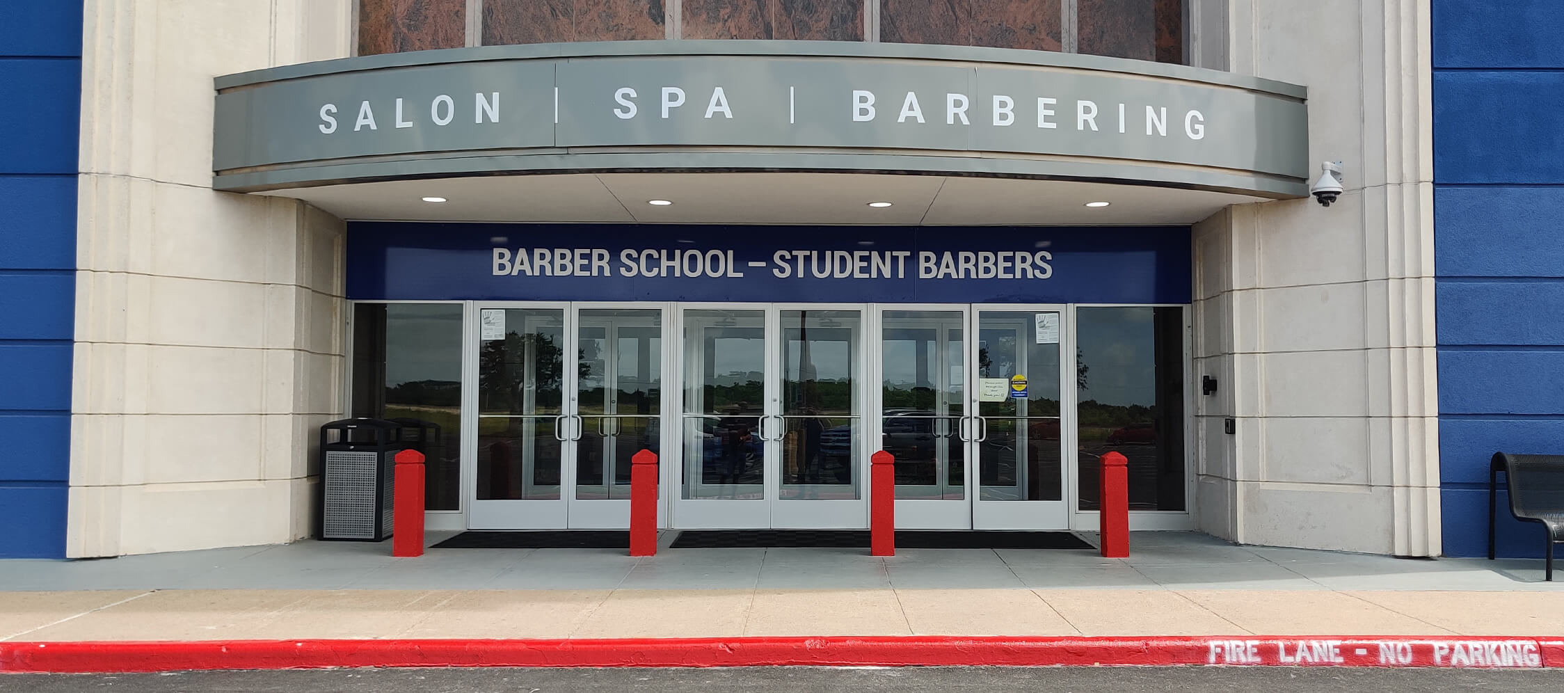
Updated marquis design and typography, red painted bollards, as well as design and placement of required barbering sign located above doors. Copyright 2023 College of the Mainland.
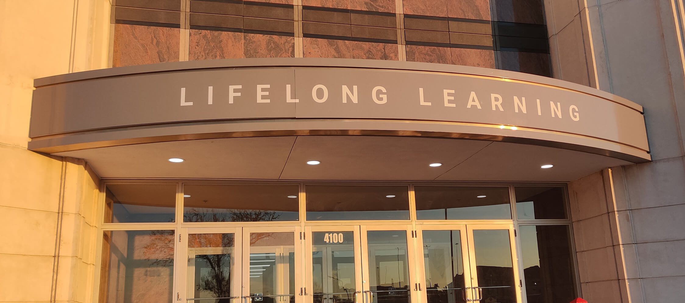
Updated marquis design and typography. Copyright 2023 College of the Mainland.

Copyright 2023 College of the Mainland. Photo credit: Scott Turnbough.
THE NEED
College of the Mainland (COM) secured a new facility at Mainland City Centre to relocate its cosmetology, barbering and lifelong learning programs. The facility previously occupied by Palais Royal was in disrepair needing a bold branded appearance across the top of the center and left sides of the building, updated marquis areas above the entrances, barbering school signage and a new feeder road marquis sign.
MY APPROACH
Overall, new signage and modifications would be designed to align with the existing structure while accurately representing the college brand. Reimagining an enormous mall location that had dwindled to an eyesore into something attractive and boldly recognizable for the college essentially meant thinking without limits. Efforts initially began with photography of the site followed by a series of realistic Photoshop mockups introducing color and branding options for the building. I would paint the entire monument-style facades at each entrance blue. The secondary building protrusions would be a darker navy to create a visual hierarchy and overall meatier substance to the exterior space ultimately drawing focus on the entrance points. Along the top above the large arches, 4ft x 40ft channel lettering would establish the brand name. The marquis overhang areas on each side were conceptualized with a slick new gray surface displaying labeled program names in bold lettering while bollards were brought to life in bright red accentuating the two entrances at a ground level. All designs were presented at executive and team levels ultimately obtaining approvals.
THE RESULT
Working with various vendors and overseeing installations, my vision was brought to life. With many positive reactions to the design, the facility’s appearance was greatly improved from its previous state. The facility’s large branded scale has become the focal center point for the entire Mainland City Centre mall providing clarity in the wayfinding and advertisement experience to the college’s location. The COM facility has become visibly notable from extended viewpoints beyond the reach of the mall property.
MY ROLE
Research, brand strategy, design strategy, environmental considerations, conceptual design, executive collaboration, graphic design, project management, vendor management